Math:
Math has always been a source of misery for me. Teachers would explain the same rules over and over again but it just…never clicked for me.
The truth is,
Why oh why would I pick something that I hate the most? Well, for starters, I like a challenge, and two, I know, better than anyone, how to make a math educational software company that actually looks and feels fun for once.
Why Math?
It wasn’t fair! I was born to be a graphic designer and forced to work on algebraic polynomials… (talk about torture!) As backwards as it sounds, when my graphic design professor assigned me an educational software company for our brand identity class, I decided to hone in on the whole math thing. I guess I just thought it would heal some old wounds.
I’m a math hater…
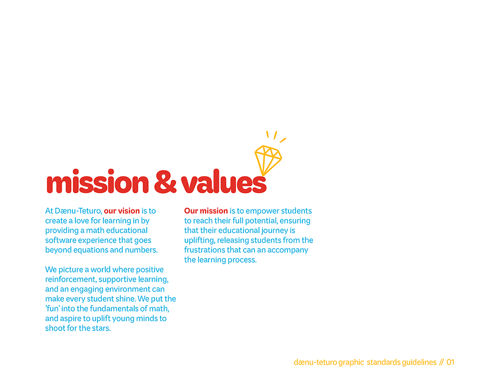
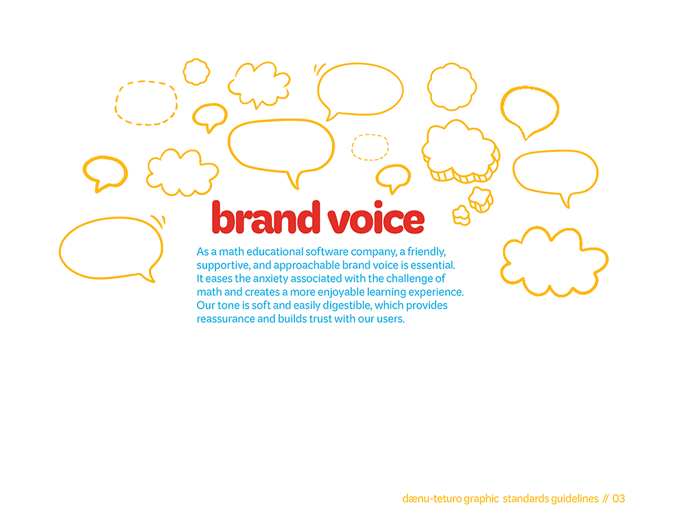
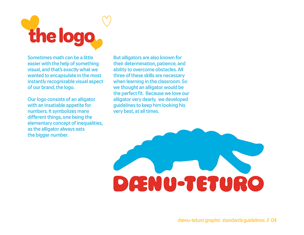
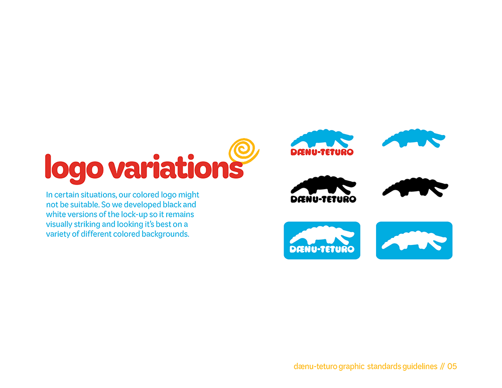
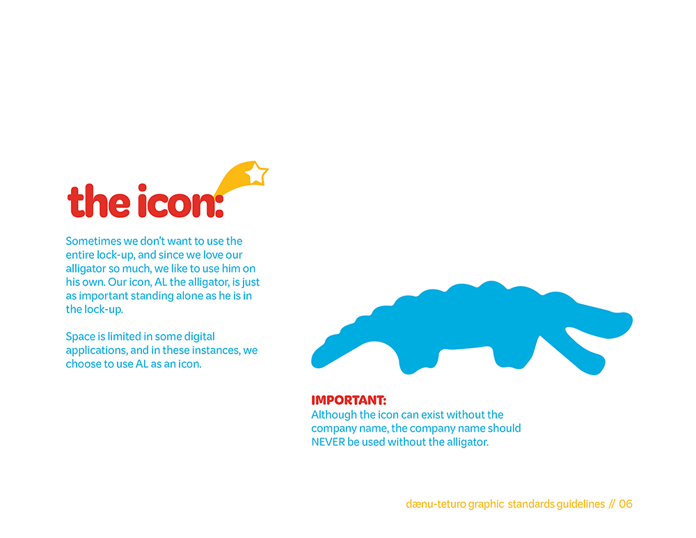
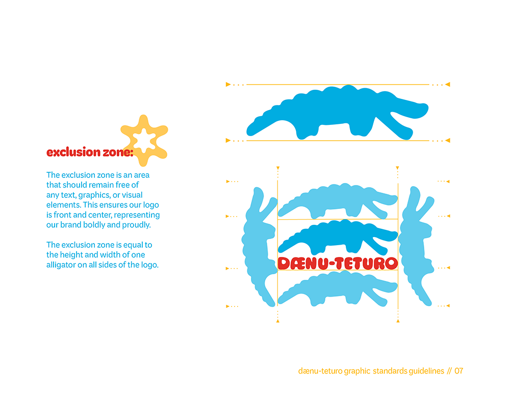
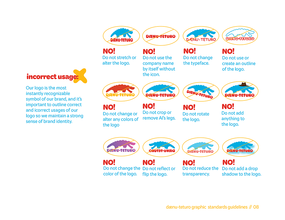
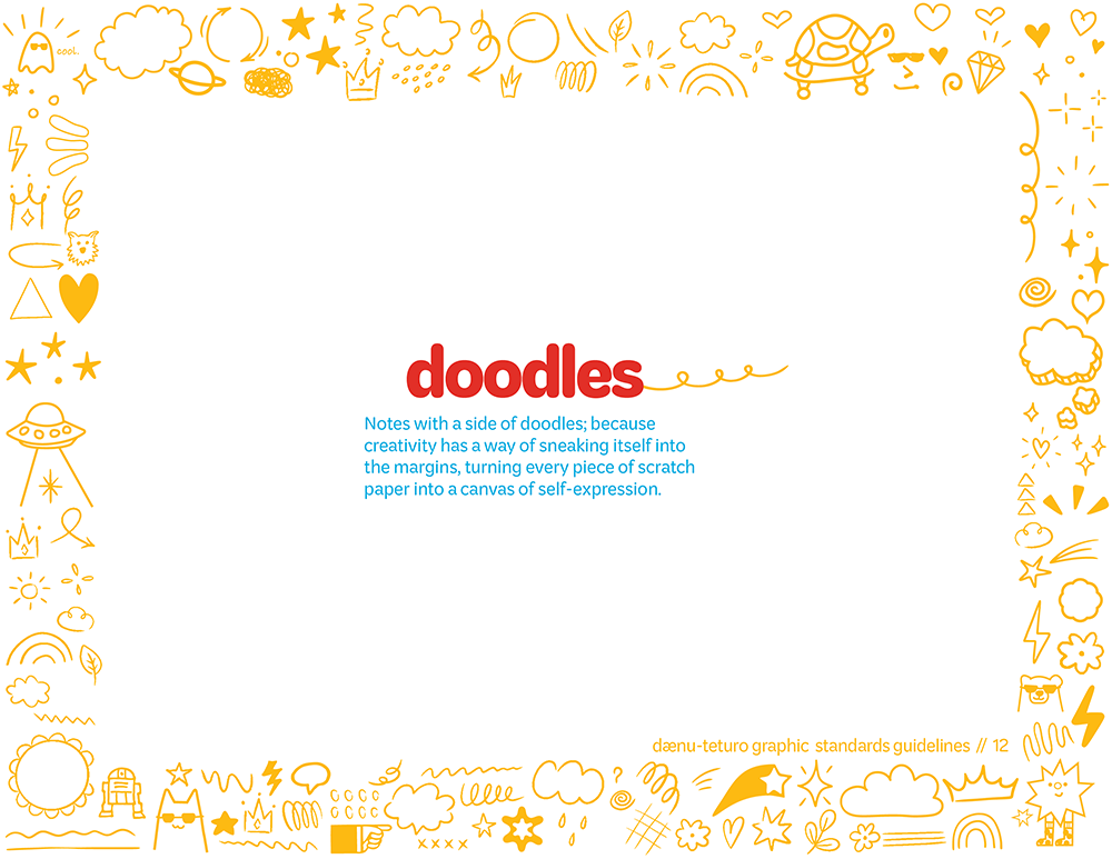
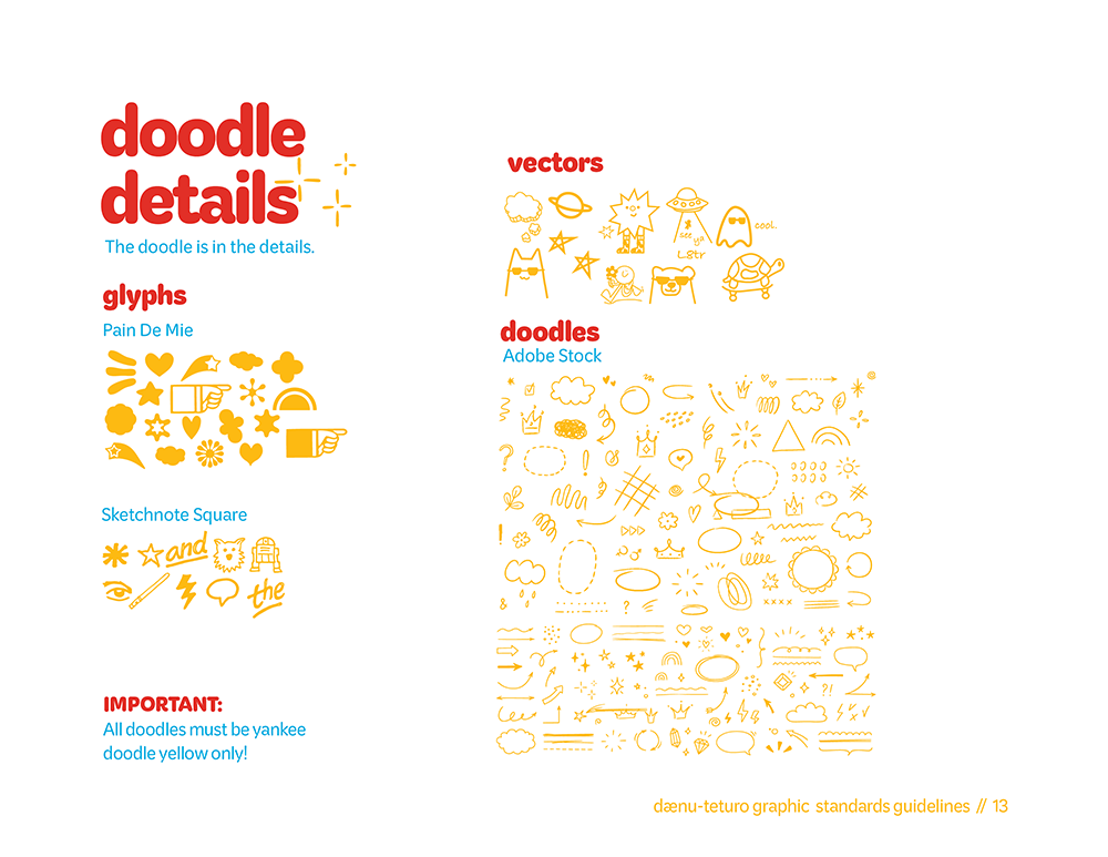
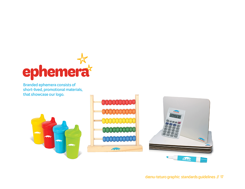
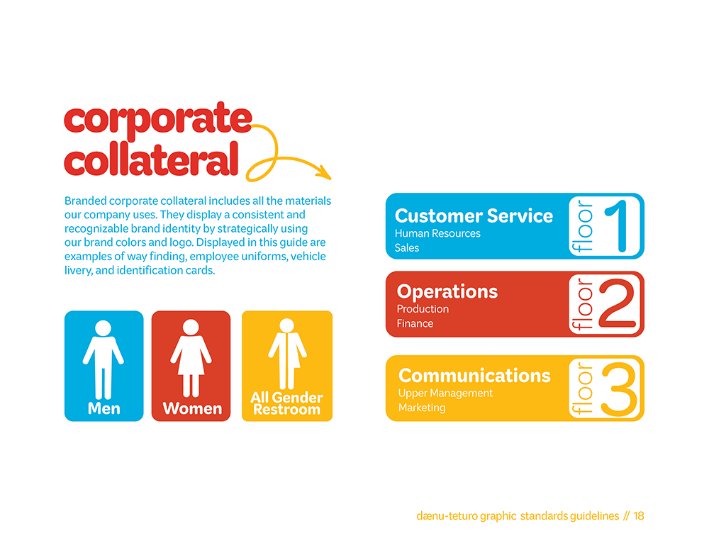
An ‘ungoogleable’ term. Don’t believe me? Search it for yourself! Dænu-Teturo, a name coined by the best college professor I ever had, James Quigley. Dænu-Teturo is the brand identity system I developed, it’s a math educational software company that targets elementary aged students. The branding is filled with bright colors, engaging doodle elements, & playful typography.
Dænu-Teturo was carefully crafted to ease the pain that is math. It’s for the kids who have to stay after class for extra help, it’s for the kids who get their test handed back and it’s full of red slashes, it’s for the kids who would rather doodle in the margins.
Dænu-Teturo
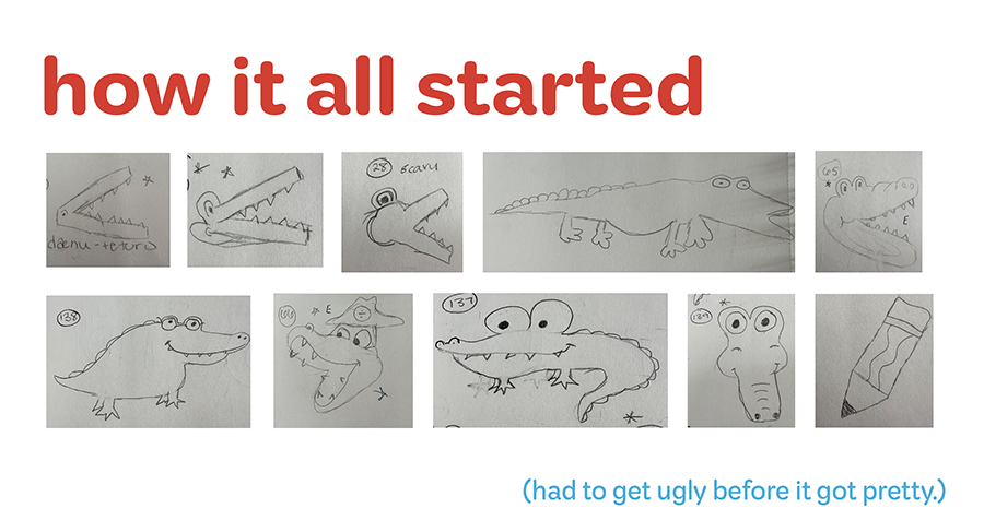


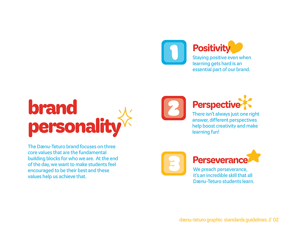
I grew fond of the competitive math software companies designed for children because they were always more interesting to look at. I always liked a more uplifting and encouraging educational approach. By using bright colors, the design has a playful bounce, which makes kids more likely to stay engaged and on task.
One of my favorite brands in grade school was Coolmathgames. I’m aware the educational benefits of some of the games on this site are questionable, but Cool Math Games showed me math doesn’t always have to be black and white, it could be blue or orange or purple too. It doesn’t have to be too many letters and symbols on a white page, it could be broken down, it could be simple, it could be…fun! And that is the type of energy I wanted to capture for Dænu-Teturo.
Methods
The Primaries
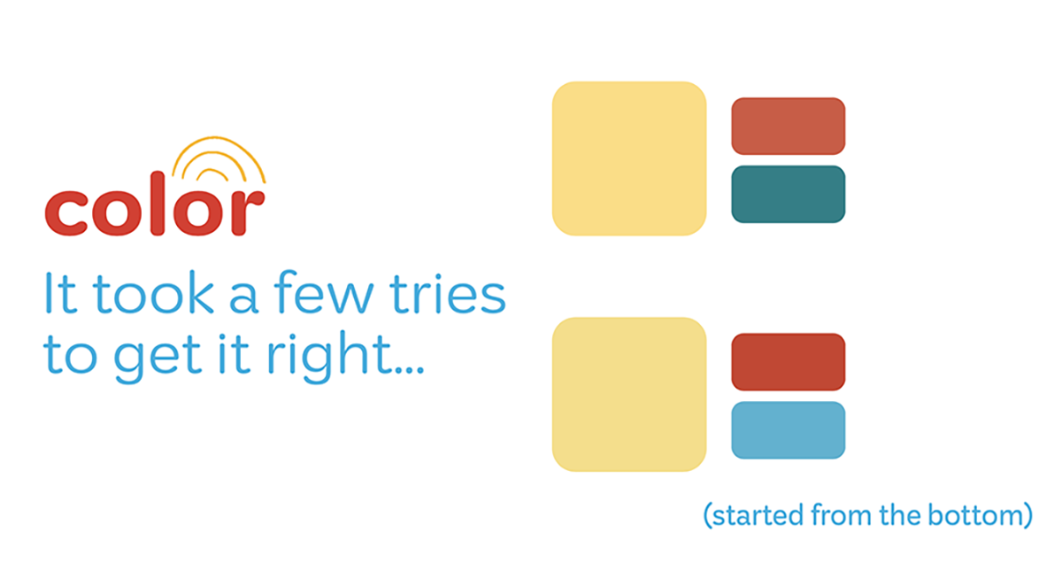
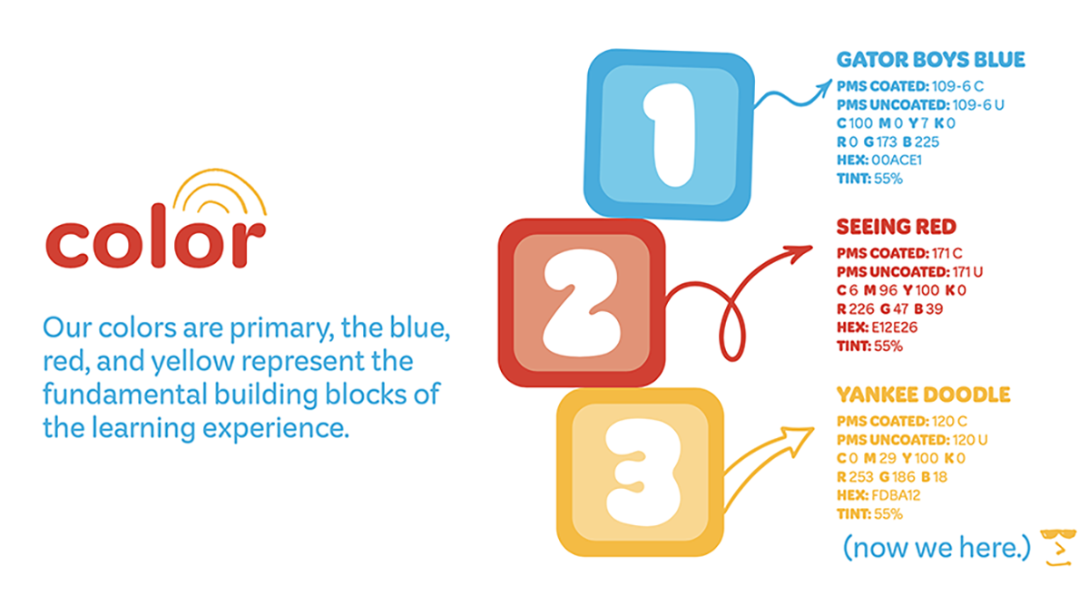
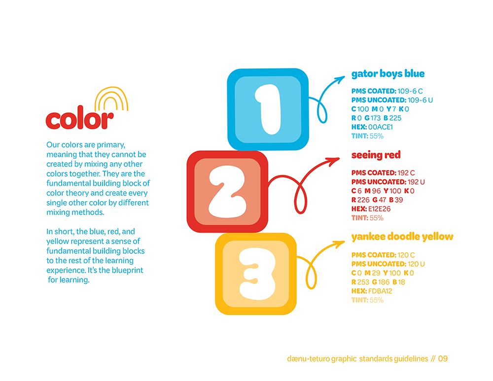
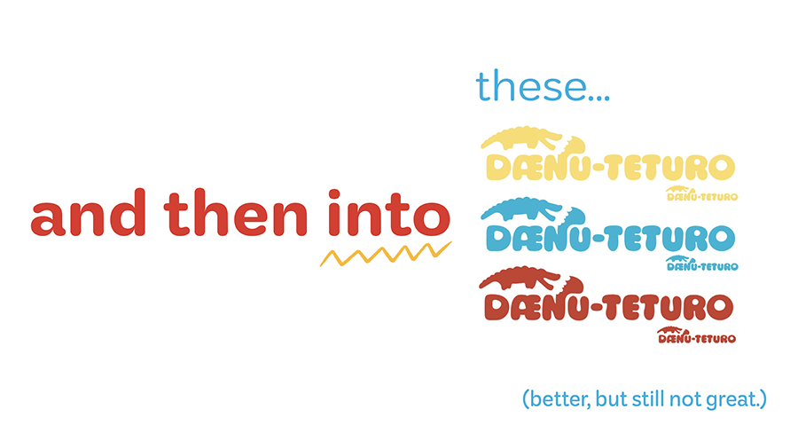
Going back to the basics, the building blocks of the color wheel, the blueprint for every other color on the planet starts with these three pigments: red, yellow, and blue, the primaries. They started off dull. I had the right idea but missed the mark.
Better & Brighter
My colors needed to perk up, so I brightened them up and made them sing.
The Type.
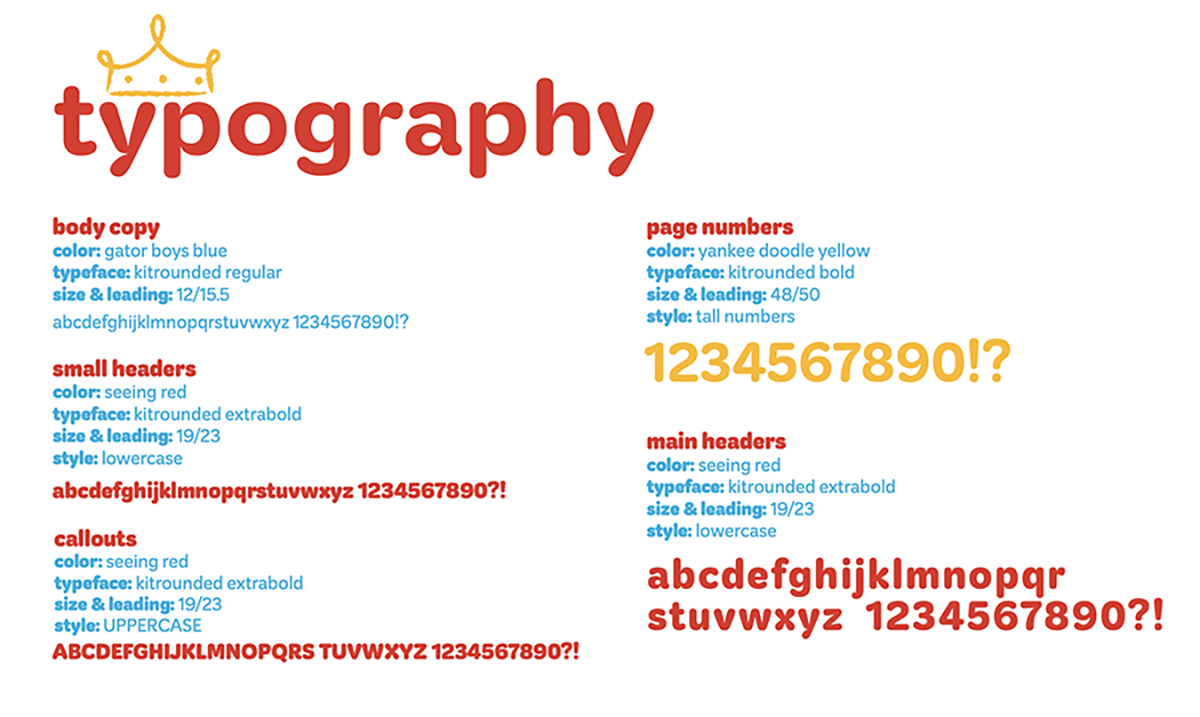
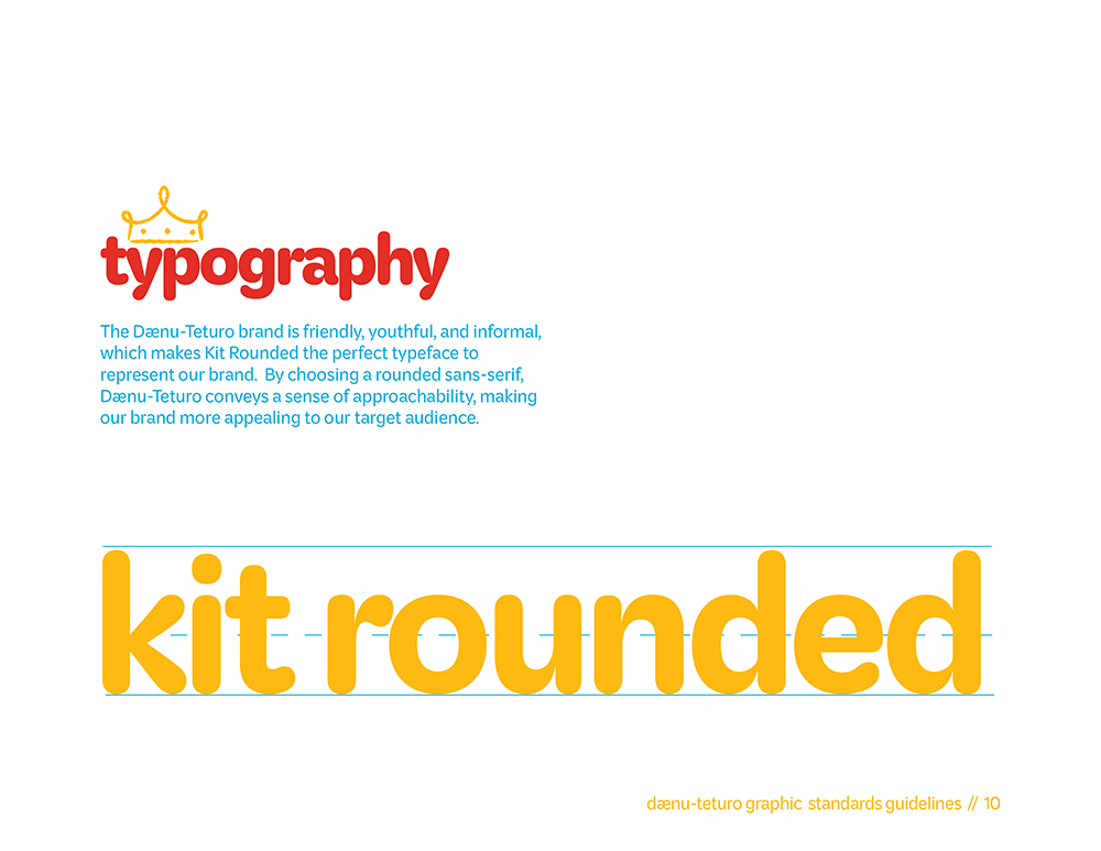
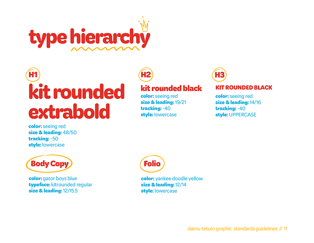
The typography meant the most to me, as the type is the strongest storyteller in design. After many weeks of debating, I landed on Kit Rounded. Kit Rounded stole my heart with that ‘x’. In all my hours of scouring page after page on Adobe Fonts, that x was unlike anything I’ve ever seen before, and it just had to be mine!
The Business Suite…
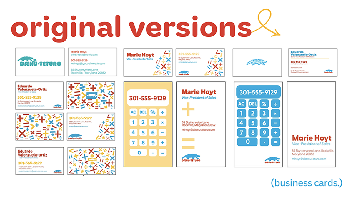
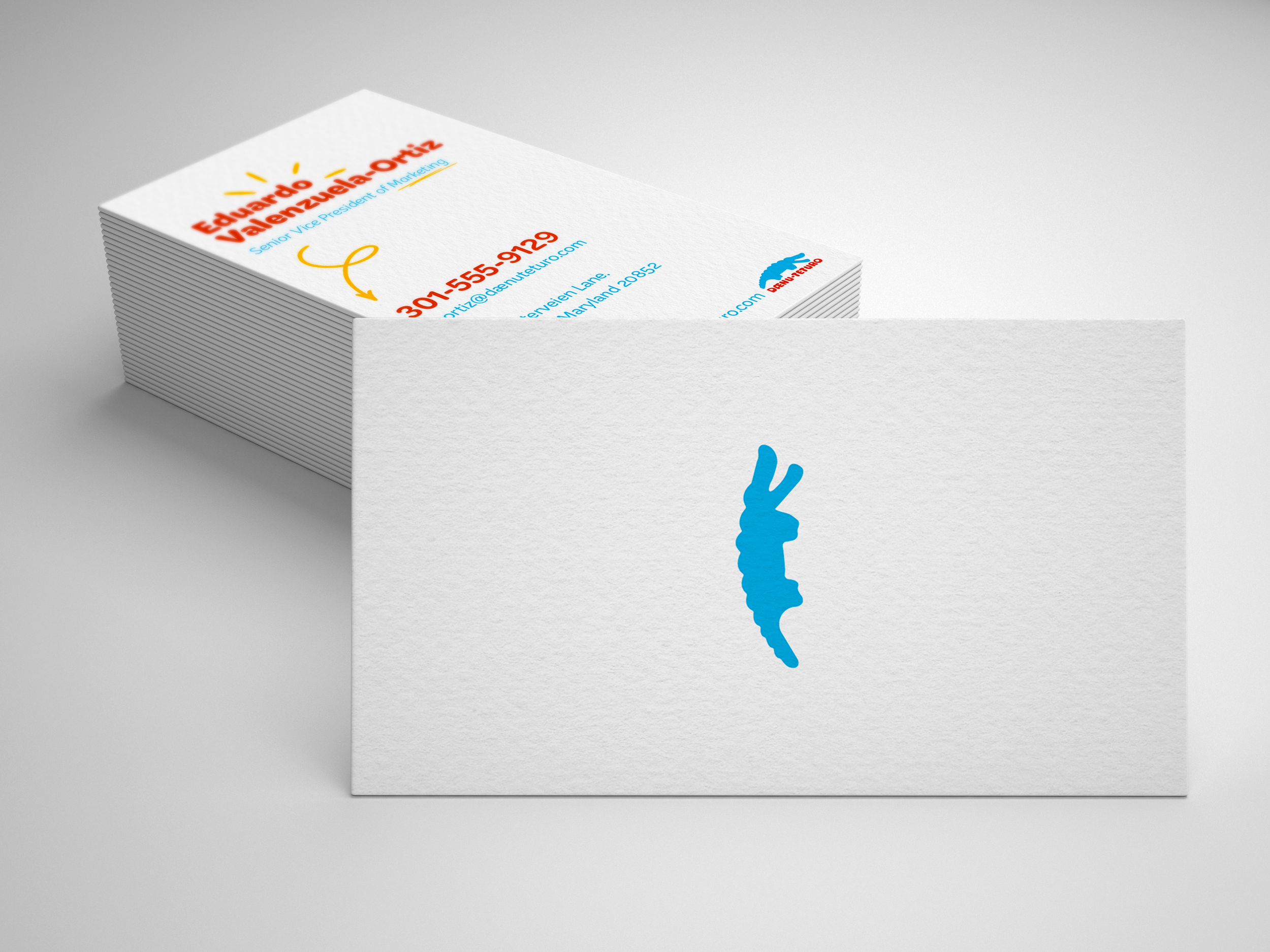
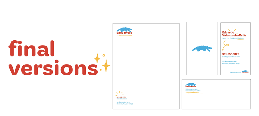
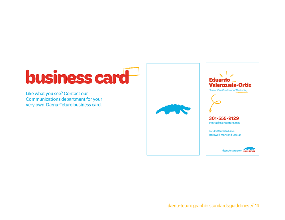
This part of the process was where it started getting difficult for me. I knew I needed to do something fun, engaging, and outside of the box to not only match the look and feel of the brand, but to make the brand stand apart from competitors. I started to conceptualize this idea of a mini calculator for a business card, I tried many different iterations, desperately twisting and turning the idea over and over, but unfortunately, because of deadlines and limited creative brain function, I had to kill the idea. I was broken up about it, upset that I couldn’t make it work in time. However, I taught by my very intelligent design professor that sometimes you have to kill ideas that you love for the good of the project. This helped me emotionally detach from the work I create, causing me to respect (and appreciate) negative feedback.
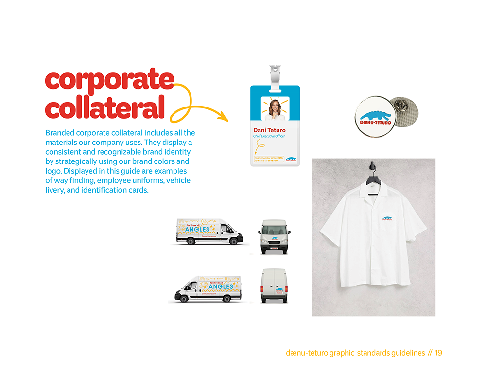
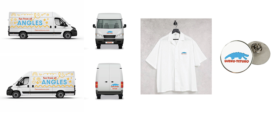
Collateral
Battling Burnout:
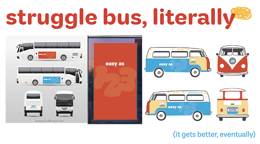
After the business suite I started to get lost. I had the bones for a (potentially) really strong brand, but my creative juices were drying up fast. This semester of college was where I learned my limits. I used to be a yes man, saying yes to everything in hopes of pleasing other people. Because of this people pleasing disease, I sacrificed my own well being and capacity to get work done. Trying to balance my most difficult college classes, executive positions in three different clubs, a part time job, a radio show, and a social life all in one semester was definitely more work than I could handle. Being this overwhelmed with responsibility led to me creating some really subpar design work. I would dread going to class because we had to put our stuff on the wall to be critiqued, and my work was drastically behind the others. Graphic design stopped being fun and started to become a burden to me.

Lesson Learned:
I decided to take a break, they say creative people need time to sit around and do nothing. So I did. I broke up with Dænu-Teturo because I had to. It wasn’t fair to waste my classmates time by putting something I wasn’t proud of on that wall, it wasn’t fair to my professor to ask for advice on a piece that I knew I was going to completely change later, but most of all, it wasn’t fair to myself to keep producing half-assed work. I was doing myself a disservice. After my break, I opened Adobe Illustrator on my laptop and faced my biggest fear, THE BLANK PAGE.
The task at hand, daunting as ever, had to be designed, bt nothing cures me more than some good old fashioned vacation. Luckily, my wires started connecting, my brain started braining, and I was able to come up with SOMETHING that could potentially work.

This project tested me in ways I never thought it would. It taught me a whole lotta CRAP (contrast, repetition, alignment, proximity), it taught me patience and perseverance, but the most importantly, it taught me when and how to say no. There’s a fine line between okay and not okay, and the amount of work (that I 100% put onto myself) wasn’t something that I could keep up with.
What can I say? I’m a people pleaser in recovery! I’m trying my best to learn my limits! I am just a girl after all, but at least I’m a girl that can defeat the notorious burnout.
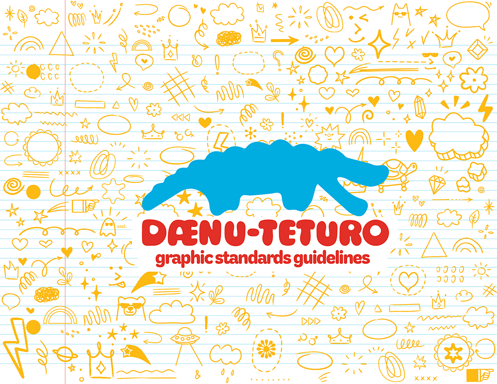
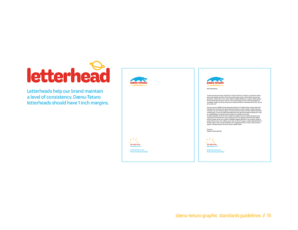
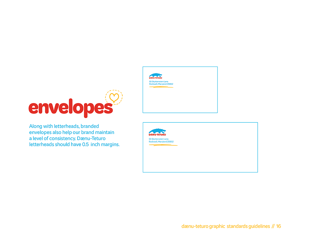
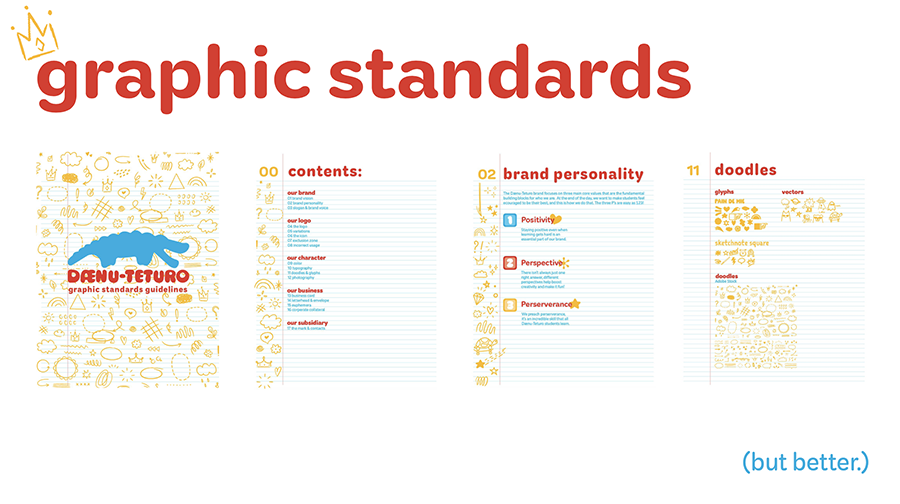
Even though this project was the bane of my existence at times, I’m grateful for everything it did for me. I look back on it fondly, it’s like…my child or something. When I look at the final version of the graphic standards guide, the brand bible if you will, I can’t help but feel like I did a good thing despite all the hardship. So here it is, in all of it’s glory. I present to you, the Dænu-Teturo Graphic Standards Guidelines.

